Art1st
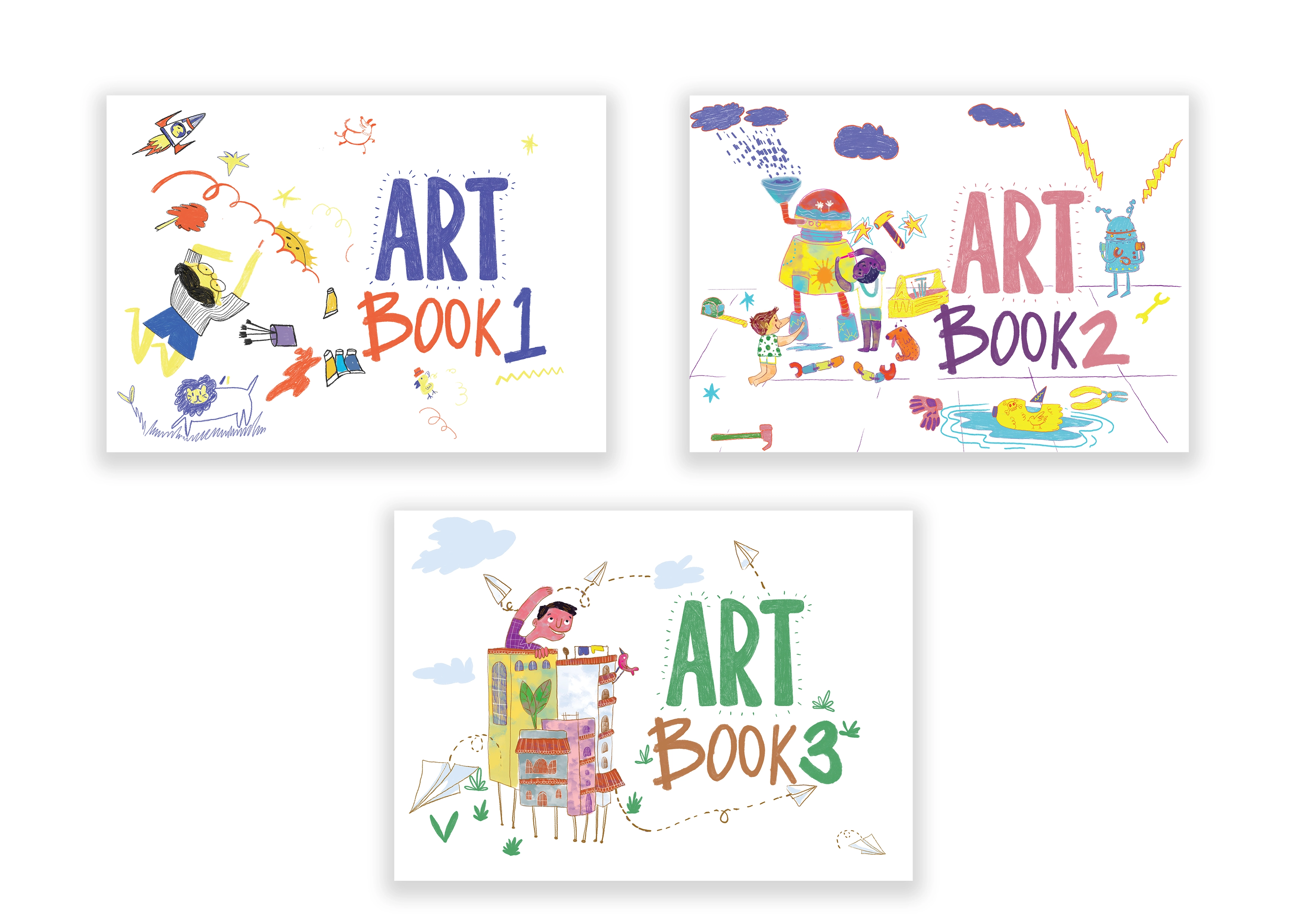
Art Books
About Art1st:
Art1st is an organisation that is focused on the importance of visual art education as a core discipline. They consistently work towards providing inclusive and accessible arts education programmes, through a variety of projects such as publishing children’s books, filmmaking, workshops, and seminars on art education.
Project Brief:
Choorma Studio was approached by Art1st to redesign and reimagine their already existing curriculum books, adapting them from a textbook format to a workbook format. While the existing books were explicitly designed to be taught by a specialised teacher, the goal for the workbooks was to significantly reduce teacher intervention.
This was not as simple as turning a textbook into a set of instructions. Rather, the process involved actively rethinking how art is taught, and how a sense of playfulness and creativity could be incorporated within a more activity-based structure. By considering how art, art history, and creative pursuits in general are taught, we hoped to use engaging stories, poems, and activities to break down more complex concepts and present them to a young audience.
Our Approach:
For the curriculum design for the workbooks, we placed a huge emphasis on a more rounded, holistic, and involved form of learning as opposed to more rote, repetitive studies. Rather than approaching art as a series of techniques to be taught and then graded – a more typical “textbook” pattern of learning – we were interested in highlighting the endless creative possibilities of the field. Through this more “open” approach, we aim for students to interact and engage with the subject in their own ways, allowing for a more diverse learning experience.
There were various logistical aspects to maintain as well, such as ensuring the content of each book worked on a 1-year timeline, and was age appropriate in both its language and ideas. In accordance with the NEP 2020, we further worked to incorporate an interdisciplinary method within our activities, imbibing activities with aspects of science, history, geography, language, and more that the students were studying. In this way, we aimed to demonstrate how art can be a unique and useful lens through which the world around us can be understood. It further solidified how art is already present within these subjects, and how students can engage with it.
Working with Art1st:
In our collaborations with Art1st for the curriculum, we experimented with countless options for the structure and layout of the book. These ranged from simple questions such as the size and orientation of the pages, to more elaborate discussions on how to include and arrange the poems and activities in a manner that made sense to our readers.
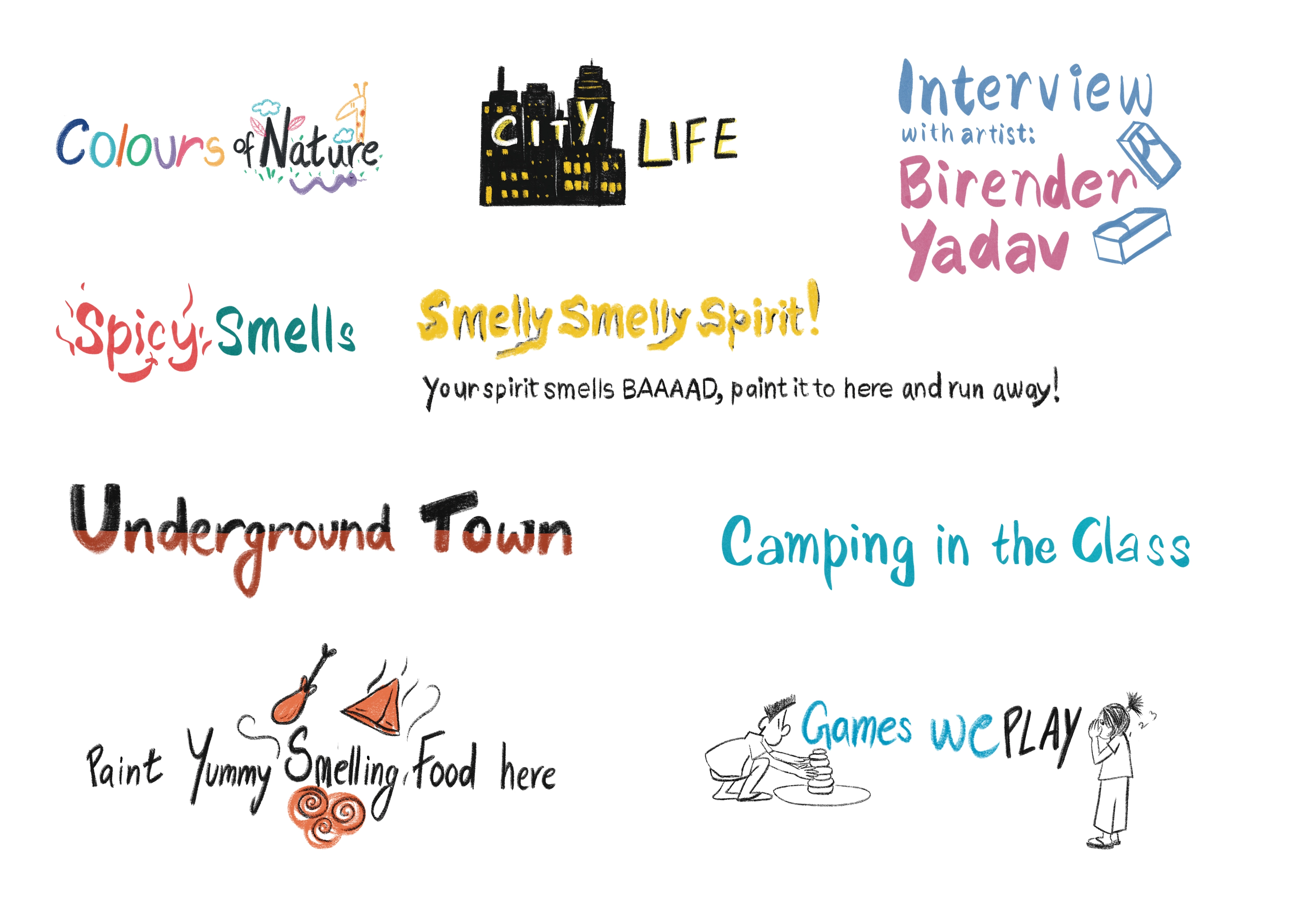
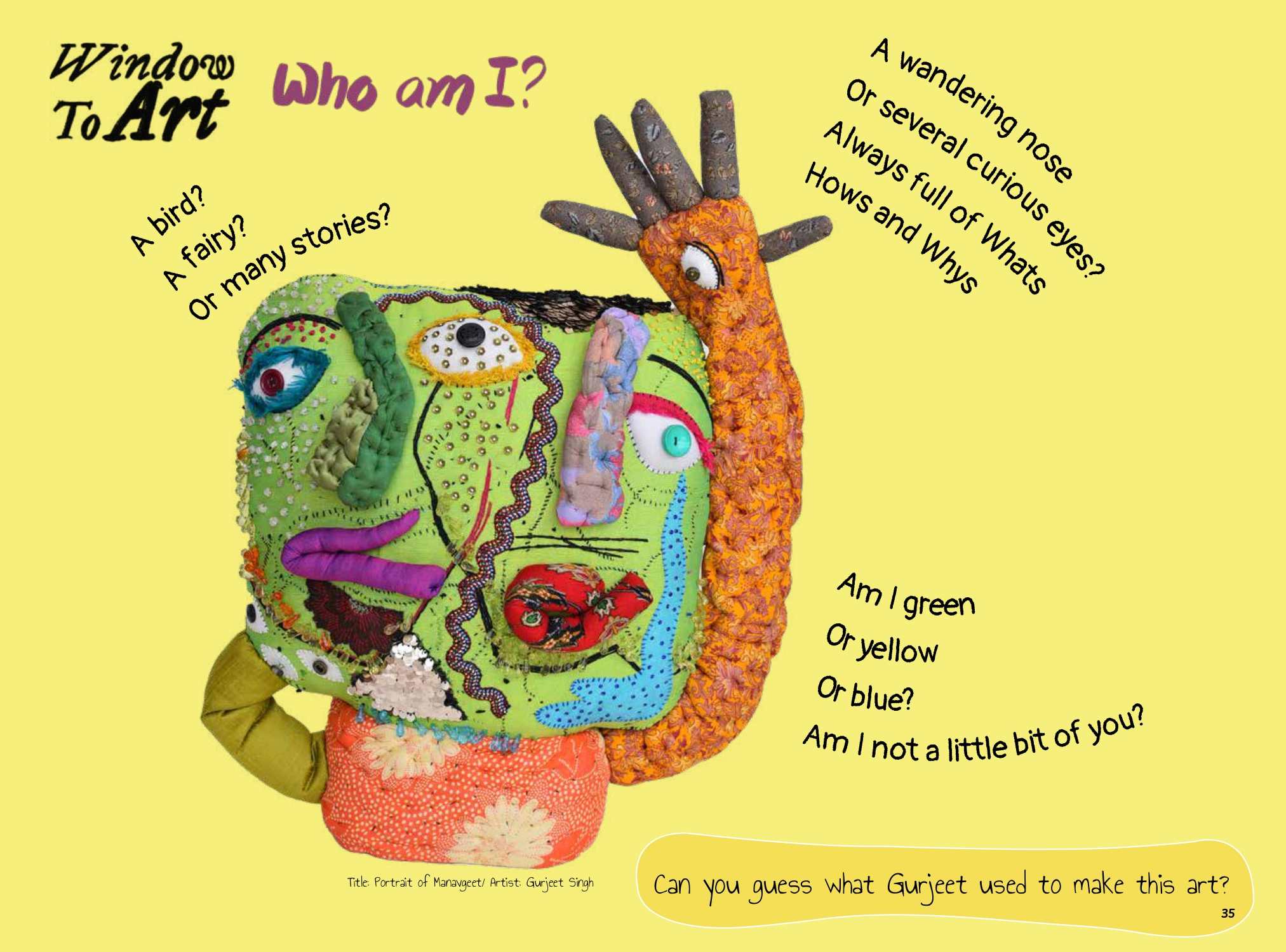
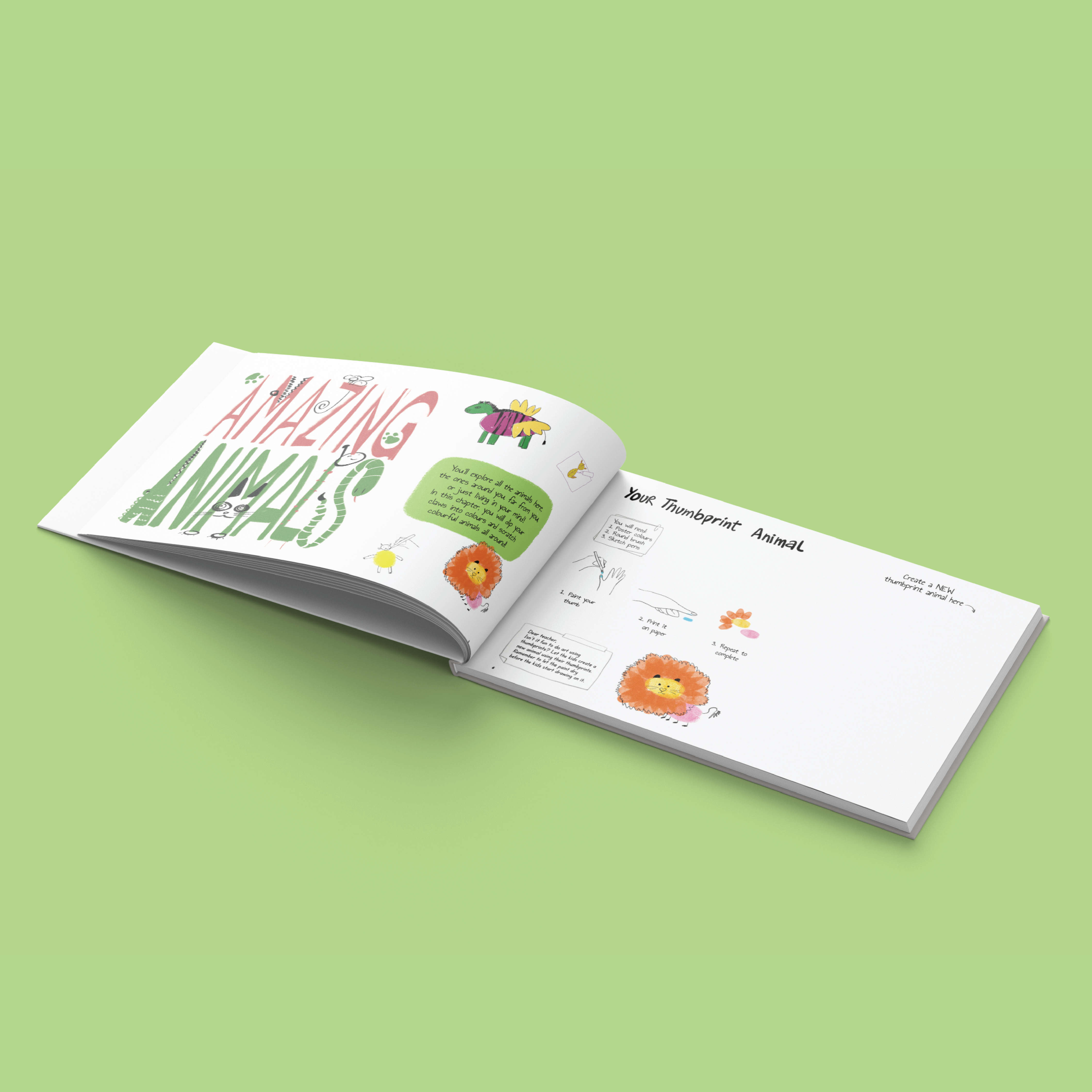
We eventually chose a format that incorporated a theme within each chapter. Every chapter began with a poem or story, followed by a related activity that utilised an aspect of the theme to teach a new technique. After the activity, the ‘Window to Art’ segment offered accessible insights into artists, while the ‘My Journal’ segment served as a kind of fun recap and documentation of their learnings and experiences over the course of the chapter.
Challenges:
One of the primary goals of the workbooks was to make them accessible to all kinds of schools and students. We had to be careful when designing activities and the book itself – considering production, printing, and design costs – to ensure we could price the book affordably. Numerous activities were scrapped during the testing phase due to raised costs.
Design and Illustrations:
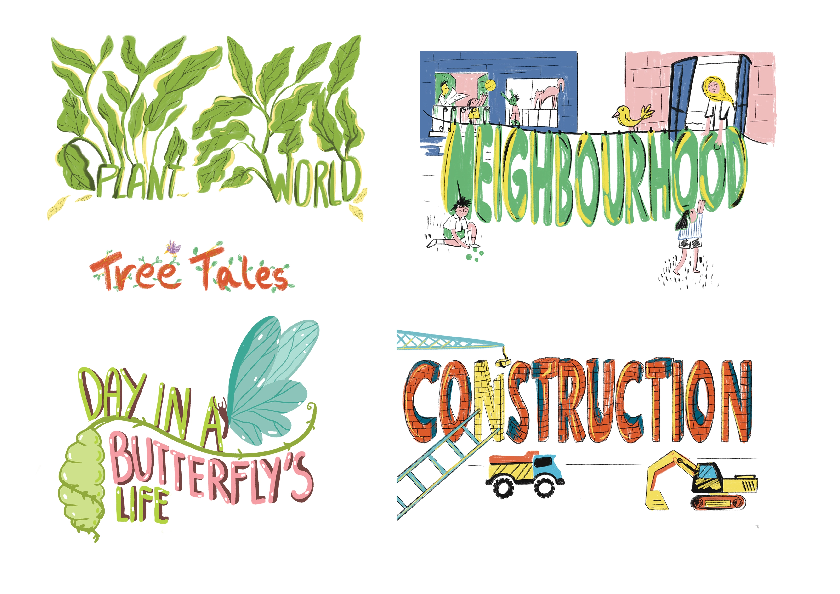
Considering the audience, and the nature of it being a playful, exciting, and fun workbook, it was an interesting creative challenge to do the illustrations and designs for the book. It was important to us to have an accessible childlike feeling that would appeal to young students, and so we used vibrant colours which had a crayon and coloured pencil-like texture to it. Moreover, a large amount of the text and typography present in the book was handwritten, and we carefully selected fonts that also produced a similar handwritten, doodle-esque effect.
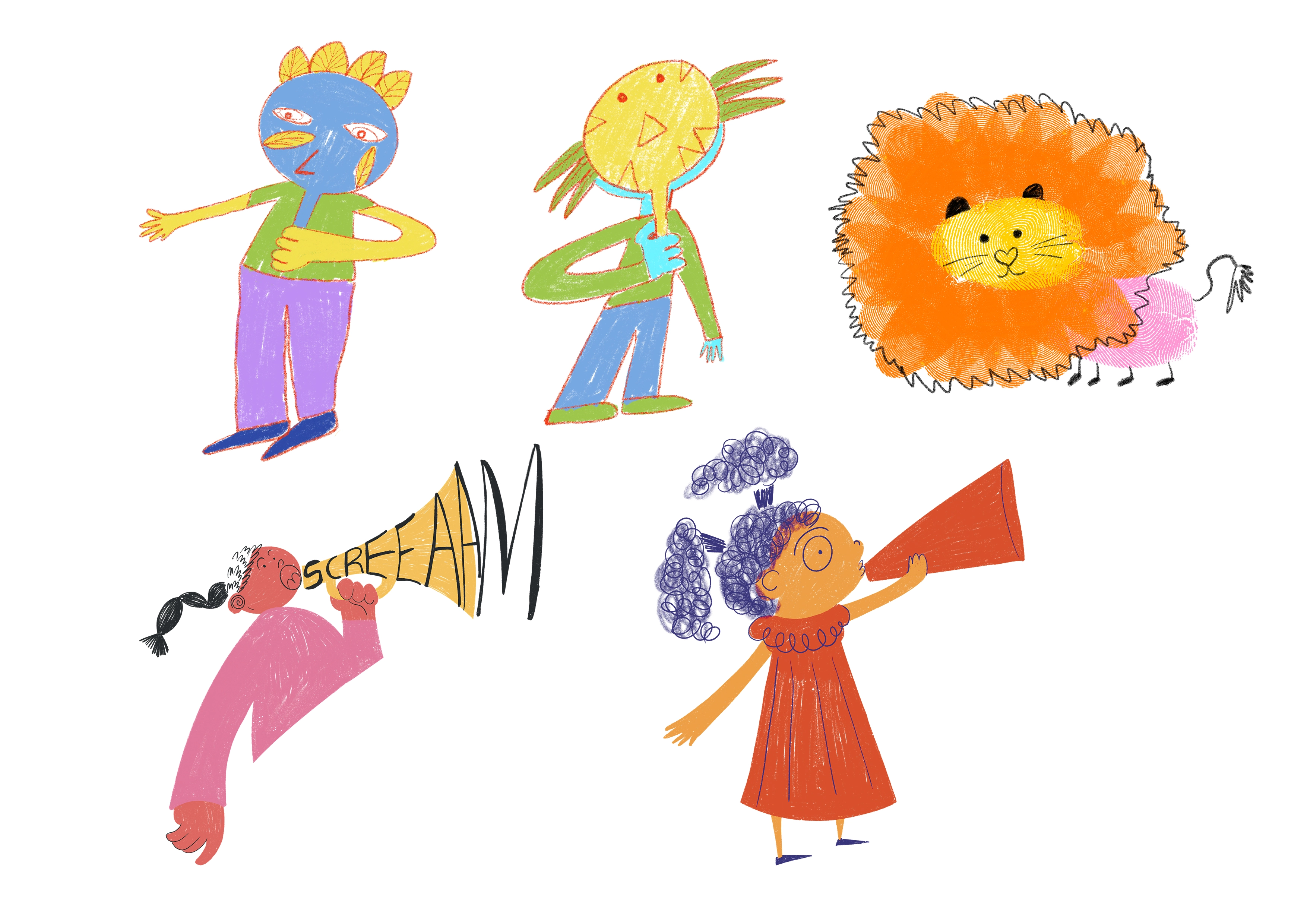
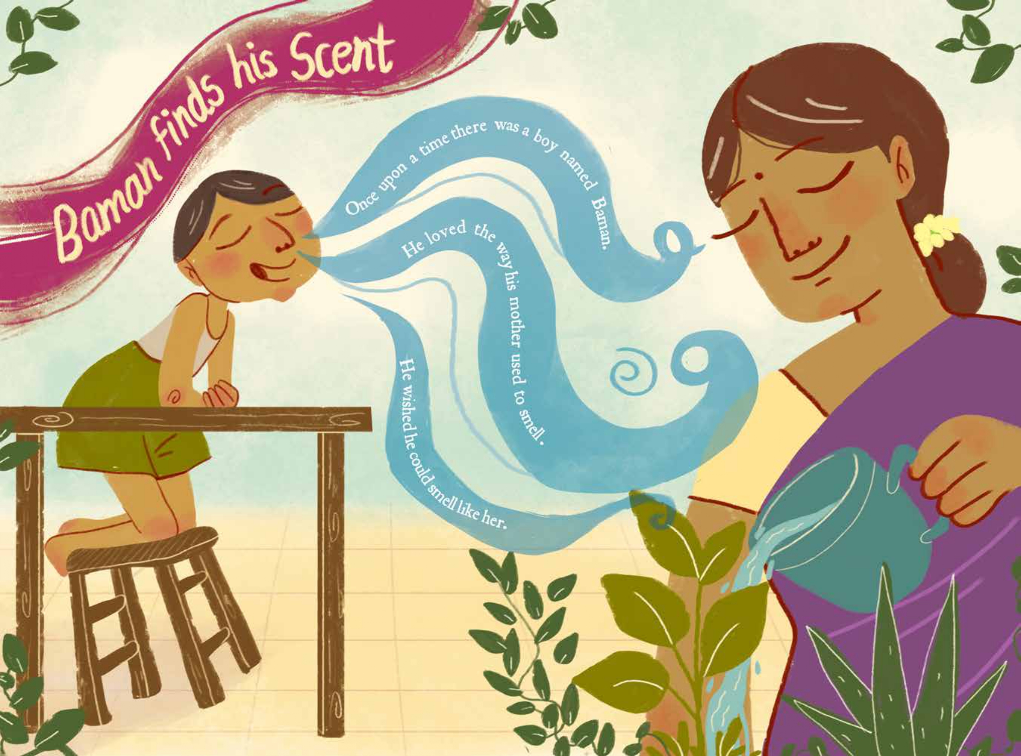
Doing the character designs for the stories and poems was a truly rewarding experience. We got to enjoy the pleasures of being a child and had fun mixing-and-matching colours just the way a child would! A green face here, a red tree there – we weren’t bound by the traditional constraints of realistic depictions. Sometimes, particularly for poems that dealt with heavier issues, like forced migration during Covid, we utilised monochrome colour palettes to portray a sense of sadness without being overwhelming.

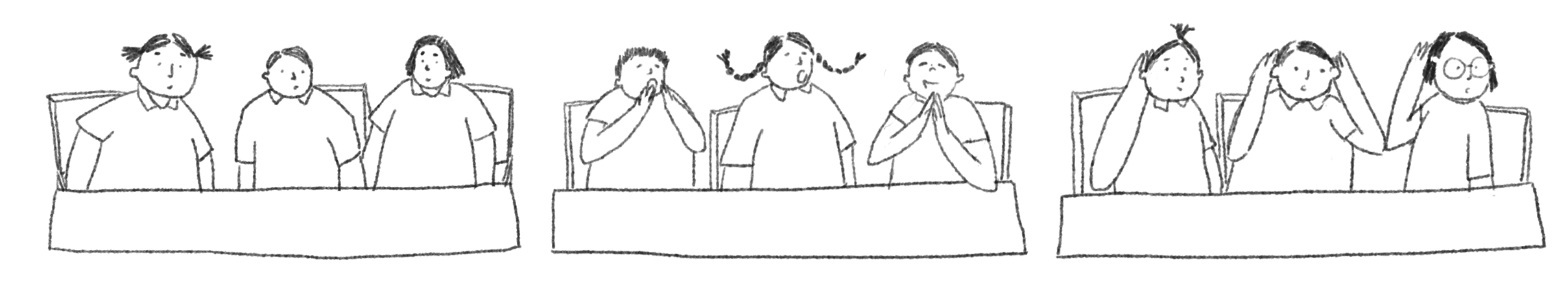
It was crucial while designing these books to ensure we were catering to the children consuming them. We experimented with different page layouts and constantly changed them to avoid monotony, while ensuring that they were readable and flowed well. In our designs, we ensured that the characters we drew were brimming with their own emotions and quirks, making them relatable and friendly for the kids reading about them.

Navigating the content:
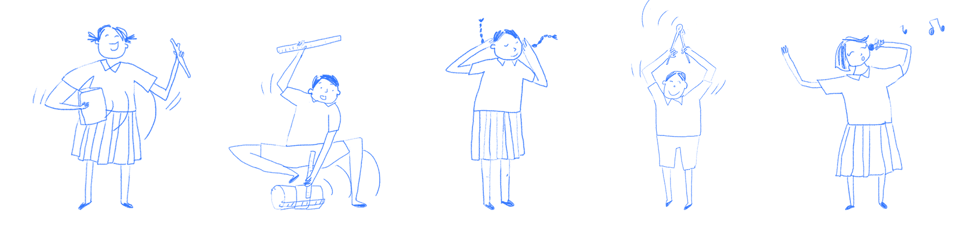
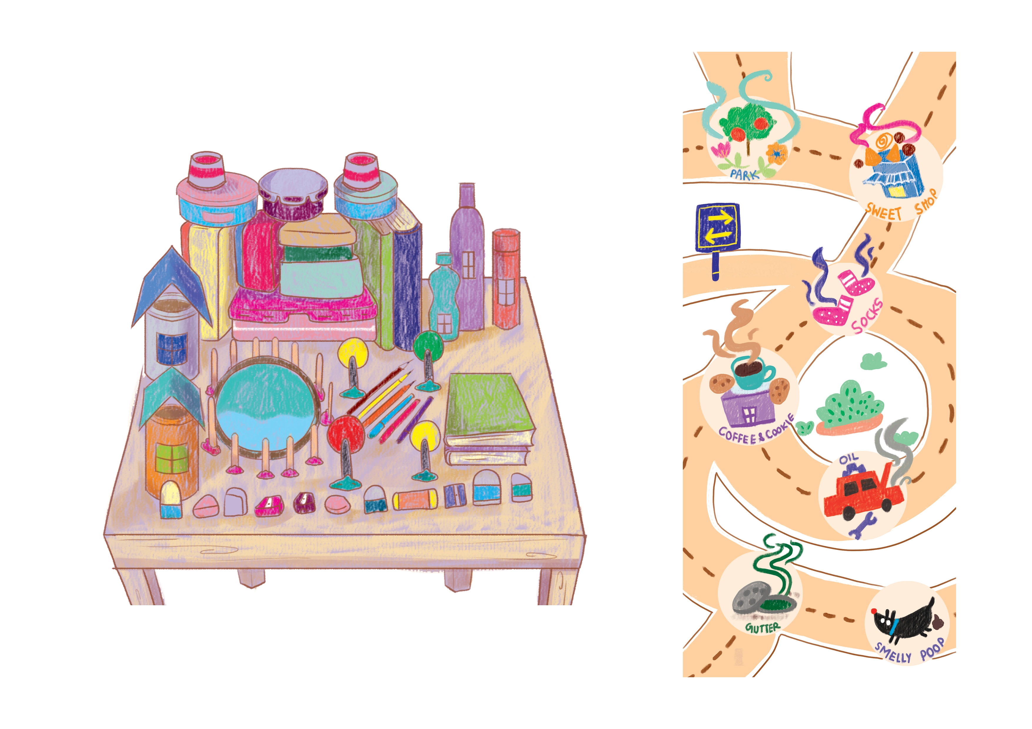
Ultimately, the most important aspect of the book is the content itself – both the text and the design. Each activity is designed to allow students to experiment further and stimulate them not only creatively, but critically as well. They were also developed to allow certain pages to be converted into pop-ups, origami, accordion formats, and more. In this way, the students interact with the book itself in a dynamic manner, cutting it up, colouring in it, and seeing it change and grow as they complete it.For segments like ‘Window to Art’, we generally avoided using only familiar and popular figures such as van Gogh and Picasso, instead using the opportunity to highlight contemporary Indian Artists. Through discussing artworks, art history, and art practices, we aspired to provoke questions in the students mind, allowing them to explore the world through artistic expression.
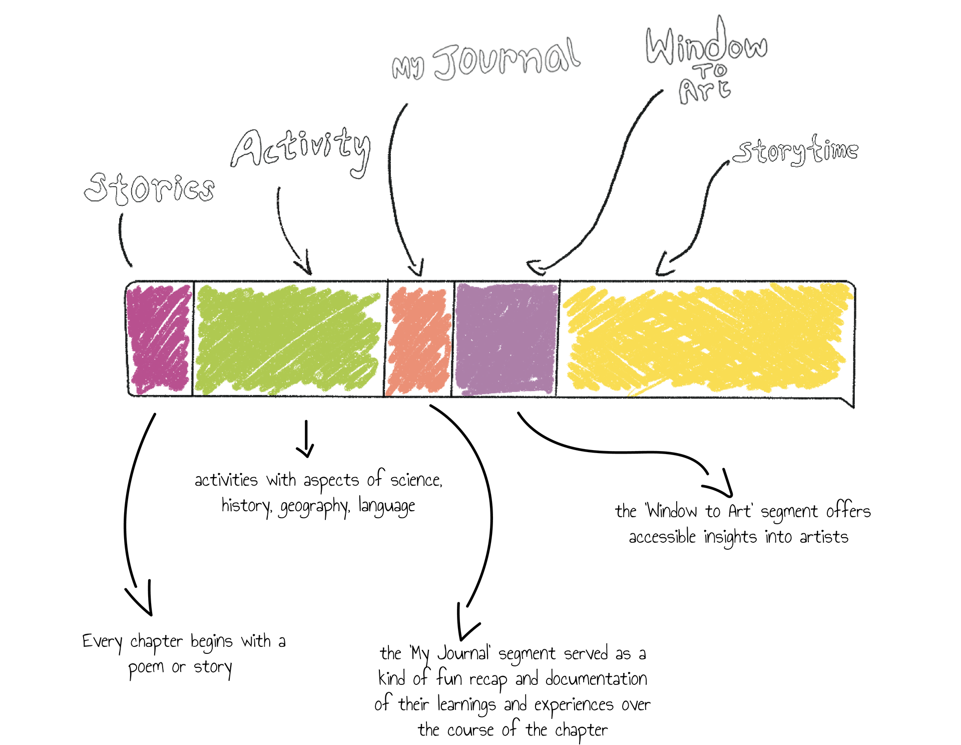
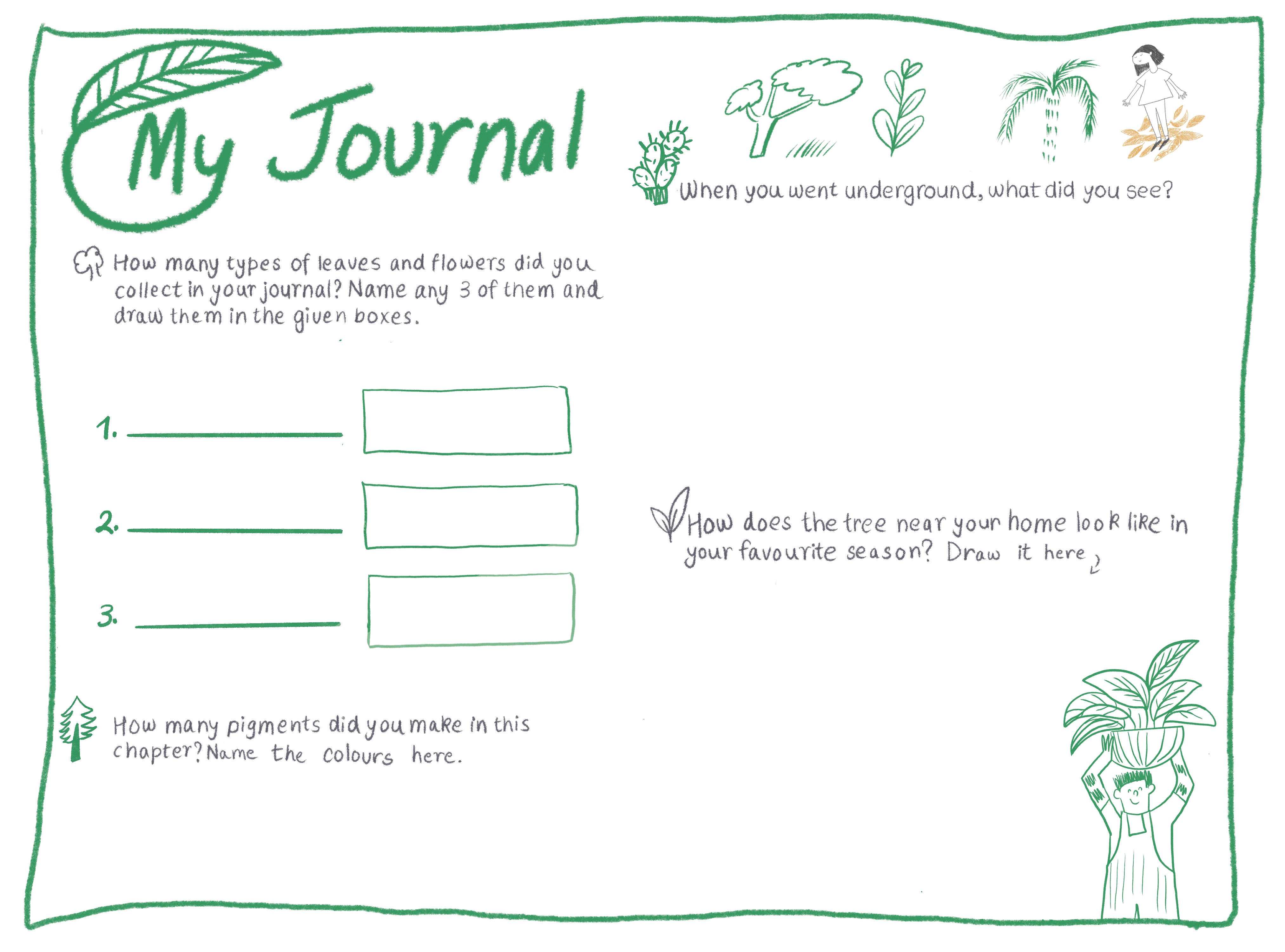
The ‘My Journal’ segment at the end of each chapter serves not only as a summary of what students learned, but also as a place to offer them probing questions, supporting any further inquiries or thinking they might do in the future.
Lastly, each book ends with a ‘Story Time’ chapter that calls for students to create their own narratives, using their learnings, the materials around them, and their own imagination to tell a story of their own.
Production:
After testing the activities, reworking them accordingly, proofreading, and valuable feedback, the workbooks were ready for printing! One of the main goals for these books was to make it accessible, relevant, and relatable for a wide audience. In this vein, we are currently working on translating the workbooks into Hindi, and in the future plan to translate it into more languages. This allows for children from across the country and from varied backgrounds to consume and learn from them, and hopefully broaden their ideas of what art can be in the process.
Credits:
Series Conceptualisation, Curriculum Design, Development: Art1st
Design and Content: Choorma Studio Art Direction: Shikhant Sablania
Writers: Dhruv Joshi, Shikhant Sablania, Madhumita Srivastava
Illustrators: Raashi Borade, Megha Bindal, Kajol Deorukhkar, Isha Johri, Anirudh Singh
Designers: Ayesha Syed, Raashi Borade, Isha Johri, Shikhant Sablania
Editors: Archana Nair, Arya Rao
Hey! We do branding too
Hey! We make cool animations also.